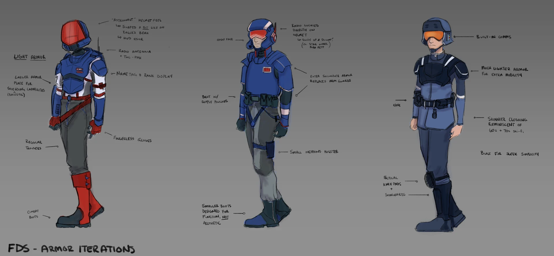
The Great Divide - FDS Uniform Exploration
For The Great Divide, I designed a visual readability system that helps players instantly identify enemy roles during combat. Enemy types are distinguished through silhouette, armor density, and color distribution, allowing players to read threats at a glance without relying on UI.
The FDS faction uses a red, white, and blue palette tied directly to gameplay roles. Each class was assigned an armor ratio that determined both armor coverage and color weighting -- lighter, faster units emphasize white for speed, while heavier units use more red to signal strength and durability.
The uniforms draw from 1970s–80s sci-fi to create a retro-futuristic look that feels functional, grounded, and believable. Multiple iterations were explored to balance gameplay clarity with faction identity.